Inspiration
The inspiration for the colour scheme comes from a hike that I did in the Great Dividing Range towards Mt. Feathertop. Along the hike, looking off to the left and the right of the trail, seeing the cascading mountains over the horizon and the colours of them. As the mountains got further from me towards the horizon, they would become slightly lighter shades that would contrast with the sky.
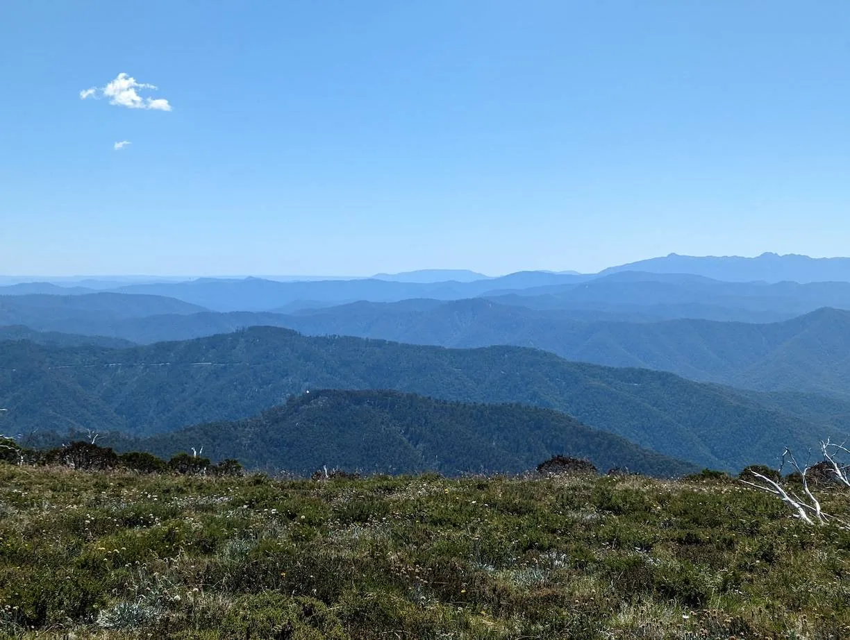
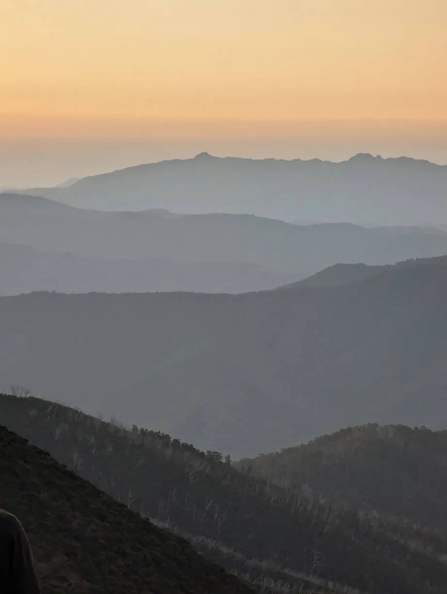
The gradients of blue to a lighter blue and three steps of blue (or in dark mode; a gradient of yellow to orange and three steps of grey) are a homage to the mountains in the distance and the sky above during the day (light mode) and at night (dark mode).
It was eye-catching and awe-inspiring, giving me the inspiration to do the redesign. I’ve been wanting to do it for a while, but this gave me the idea for a design that I thought I could pull off.
Implementation
I started off by having a look at some CSS background panel implementations that people have made online. From this the best option looked like using CSS gradient and setting the gradient percentage markers so that the colours don’t blend into each other.
background: linear-gradient(
  to bottom,
  #91cdff 0%,
  #bcdffd 40%,
  #76b6f4 40%,
  #76b6f4 60%,
  #69a5e4 60%,
  #69a5e4 80%,
  #4c87c1 80%,
  #4c87c1 100%
);
I then chose my colours by looking at the photos I took of the mountain ridges and using an eye dropper tool to select the colours from them. I then played around with different sizes of each of the panels (the strips of colour in the wallpaper).
I also wanted to play around with the CSS media property prefers-colour-scheme.
I’d heard about this a fair bit and I thought it was handy to be able to hook into the device’s dark mode preferences.
I thought this would be a great chance to try it out since I had photos of the mountain ridges during the day and during the night.
Using the API was quite straight forward and simple to reason about.
It seems like a lot of kind of modern web APIs are getting quite user-friendly, not too much hacking about anymore which is great.
@media (prefers-color-scheme: light) {
  .class {
    background: #4c87c1;
  }
}

@media (prefers-color-scheme: dark) {
  .class {
    background: #4e4f54;
  }
}
The actual like implementation of the main wallpaper was quite straightforward. The complexity of it came in while trying to apply this across the site. Prior to this, the design system was not very uniform and a bit all over the place. I ended up spending a bit of time unifying it to have a more consistent design language. Even though it’s still quite inconsistent, but it’s a step in the right direction. A fair amount of time was spent making all of my components to play nicely with the new colour scheme. I also took the time to uplift a lot of the code to TypeScript since I’d originally built them in JavaScript a long time ago.
There were a couple minor adjustments I needed to make for mobile view that had fallen by the wayside for a while. So I followed my theming changes with a small pull request just to neaten up mobile view.
What’s next?
I’d like to update the projects page. The projects page is quite outdated since I haven’t really worked on these projects in a while. They’re not in a very healthy state, and I’m not too interested in working on them anymore. I would probably need to find some projects actually want to work on.
I also wouldn’t mind taking a look at the implementation of the garden gallery. It was a quick and dirty initial implementation that I haven’t touched for a while. There’s a lot more features and fanciness I’d like to add. The ability to see like a timelapse or photos from a specific time and timestamping them in the code, so I can provide better alt text for them.